Overview
BHAIBYE is a small teaching package with an interactive Shiny app and two tidy datasets to explore the burden of healthcare-associated infections (HAIs) in Germany and the EU/EEA. You can:
browse per-HAI totals (bubble / bar),
compare Germany vs EU/EEA at rates per N people (with a slider),
view 95% uncertainty intervals (UI) everywhere they matter.
This vignette shows how to load the data and how to use the app effectively.
Installation
install.packages("pak")
pak::pak("ETC5523-2025/assignment-4-packages-and-shiny-apps-ruby910113")
Load the package:
What data are included?
Two compact data frames ship with the package:
bhai_summary- annual totals for Germany (German PPS) by HAI type with point estimates and 95% UI.bhai_rates- rates per 100,000 for Germany (German PPS) and EU/EEA (ECDC PPS), by HAI type and metric (HAIs, Deaths, DALYs), with 95% UI.
App tour (what each view shows)
-
Bubble (per HAI)
X = annual HAIs (cases), Y = attributable deaths; bubble size = DALYs.
Hover tooltips show 95% UI for cases / deaths / DALYs.
-
Bar (per HAI)
Choose metric (HAIs / Deaths / DALYs). Bars are colour-coded by HAI type.
Vertical error bars = 95% UI.
-
Geo comparison (per N)
Compare German PPS vs ECDC PPS (EU/EEA) for the chosen metric, as rates per N people. Use the slider to change N (e.g. 1,000 … 100,000).
Error bars show 95% UI. Overlapping intervals suggest limited separation.
-
Read the summary text under the plot: for each HAI it prints
Type - German PPS shows X per N and ECDC PPS shows Y per N ([Who’s higher] by Δ).
This updates live when you move the slider or switch metric (it will also say Tie when values are equal).
Example: Exploring the burden of HAIs interactively
The BHAIBYE app helps answer common questions about
healthcare-associated infections (HAIs) in Germany and the EU/EEA.
Below are example questions and how you can explore them using the
app.
💡 Question 1: How do total HAIs, attributable deaths, and DALYs compare across infection types?
In the sidebar, under View, select Bubble (per HAI).
-
Each bubble represents one infection type (HAP, UTI, BSI, SSI, CDI).
The x-axis shows total annual HAIs.
The y-axis shows attributable deaths.
The bubble size shows DALYs (combined YLL + YLD).
Hover your mouse over any bubble to see the exact numbers, including 95% uncertainty intervals.
Use the HAI types checkboxes to filter and compare only selected infections.
Illustrative Figure:
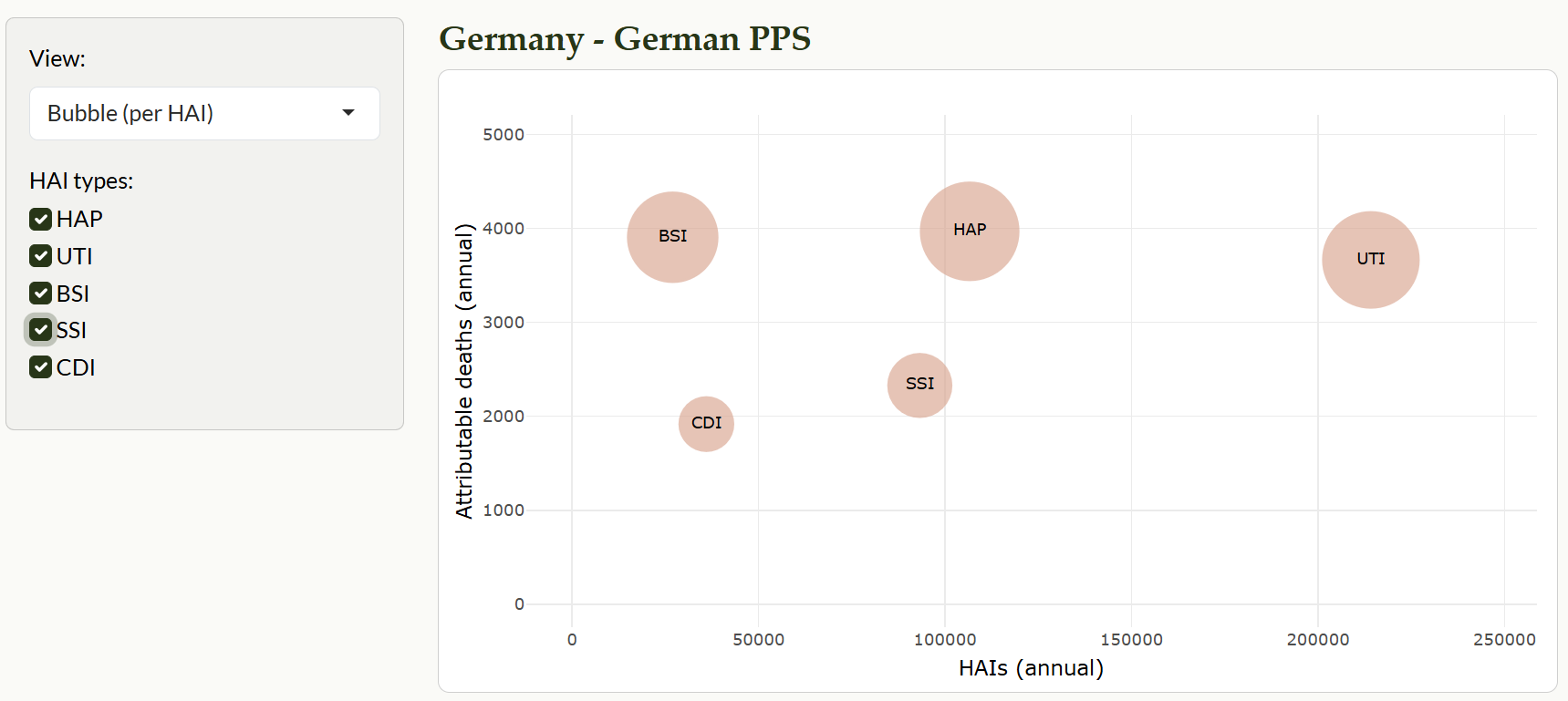
Example - Bubble (per HAI): x = HAIs, y = deaths, size = DALYs (95% UI on hover).
💡 Question 2: How do infection types contribute to DALYs, Deaths, and HAIs in Germany?
In the sidebar, set View to Bar (per HAI type).
Under Metric, choose the measure you want to explore (DALYs, Deaths, or HAIs).
The chart displays total annual values by HAI type, with error bars indicating 95% uncertainty intervals.
Hover over any bar to see exact numbers, including the 95% uncertainty interval.
Use the HAI types checkboxes to filter and compare selected infections.
Illustrative Figure:
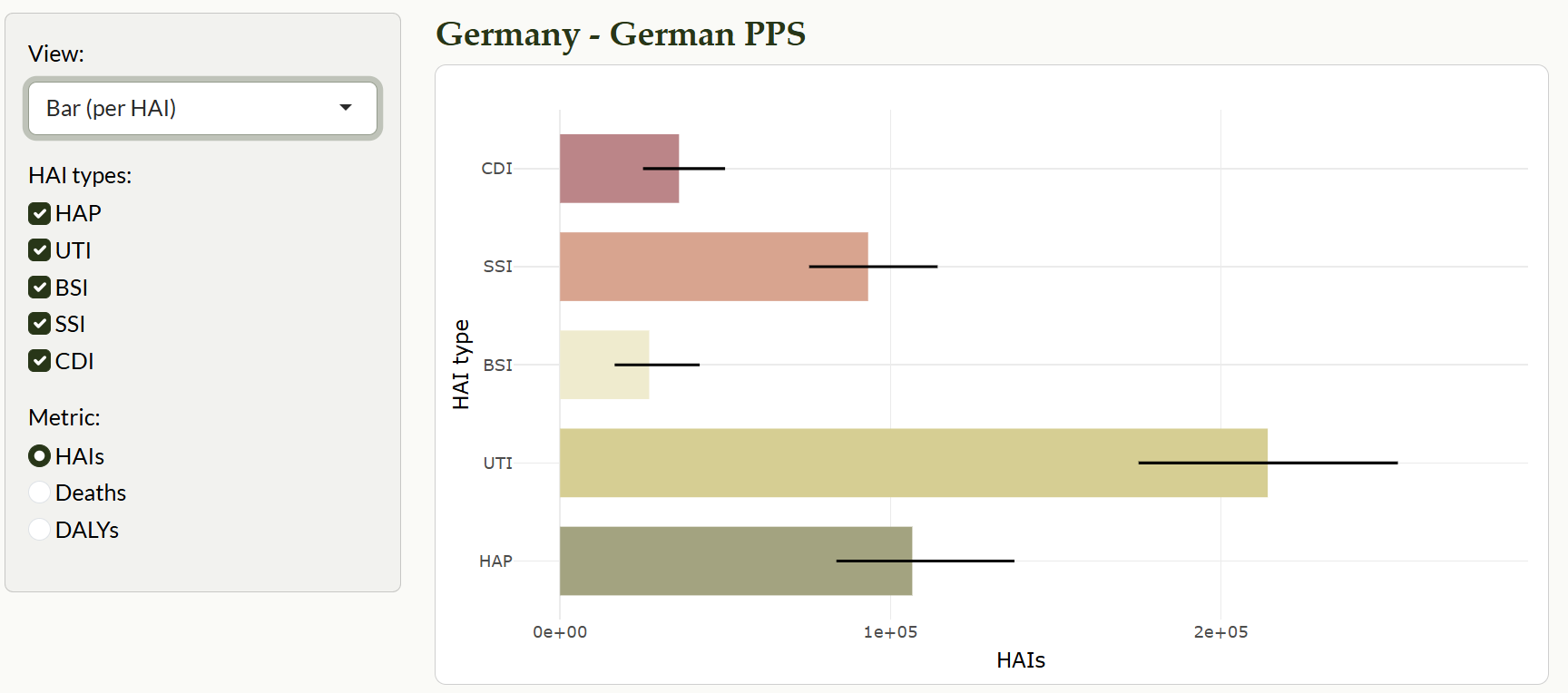
Example - Bar (per HAI type): totals by infection type with 95% uncertainty intervals.
💡 Question 3: How does Germany compare with the EU/EEA overall?
In the sidebar, set View to Geo comparison (per N).
Under Metric, choose the measure you want to explore (HAIs, Deaths or DALYs).
Adjust the Scale (per N population) slider to rescale the rates (e.g., per 100,000).
The bar chart shows Germany vs. EU/EEA for each HAI type.
Read the text summary below the chart, which automatically highlights which region has higher rates and by how much.
Illustrative Figure (Bar):
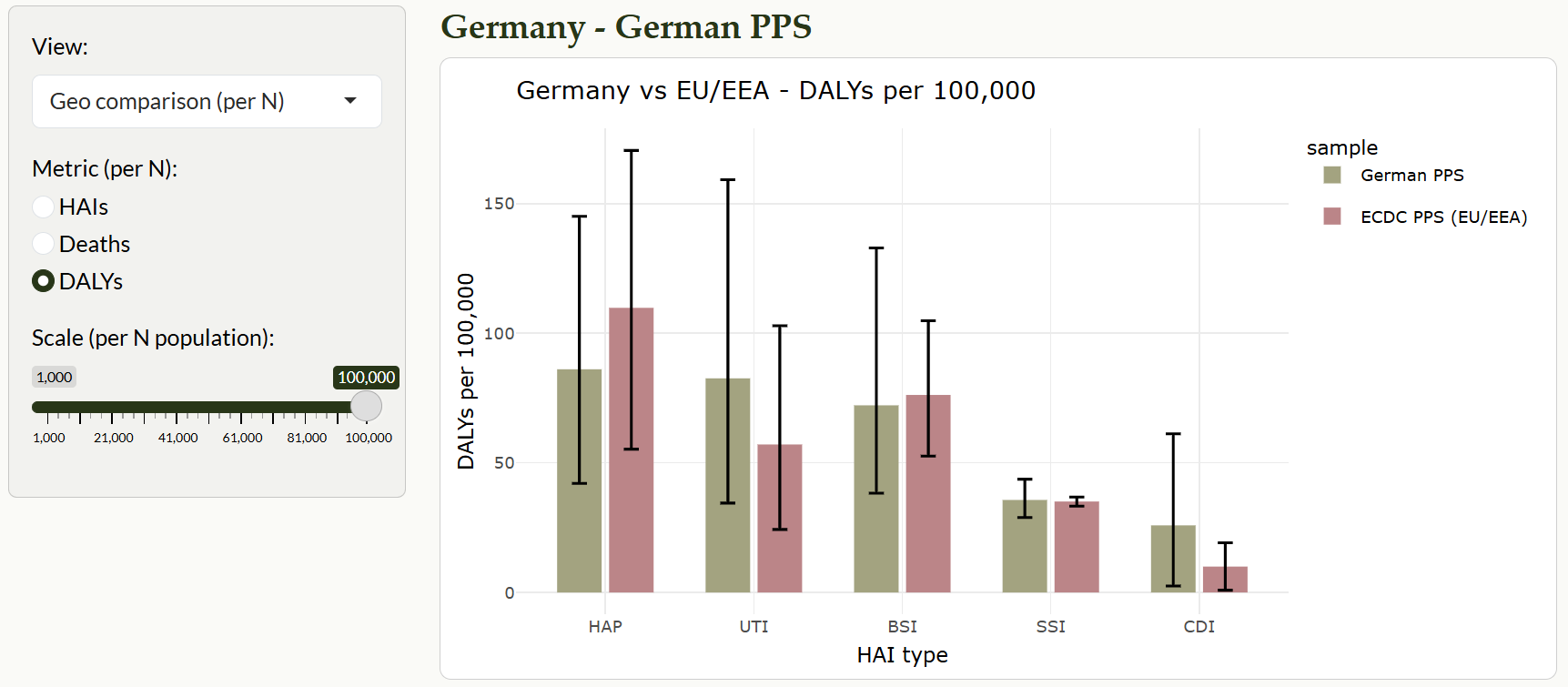
Example - Germany vs EU/EEA: bar comparison by HAI type, scaled per N population.
Illustrative Figure (Summary):
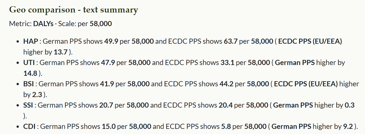
Example - Auto-generated summary highlighting which region is higher and by how much.
Sources
Eurosurveillance article: https://www.eurosurveillance.org/content/10.2807/1560-7917.ES.2019.24.46.1900135#html_fulltext
Package Structure
assignment-4-packages-and-shiny-apps-ruby910113/
├─ ETC5523_assignment4.Rproj
├─ R/
│  ├─ launch_app.R          # exported launcher
│  └─ BHAIBYE.R             # package-level docs
├─ inst/
│  └─ shiny/
│     ├─ app.R              # main app
│     └─ www/
│        └─ app.css         # custom styles
├─ data/
│  ├─ bhai_summary.rda      # HAI totals
│  └─ bhai_rates.rda        # Rates per 100,000
├─ data-raw/
│  └─ bhai_dataset.R        # reads/cleans sources → saves .rda
├─ vignettes/
│  └─ BHAIBYE.Rmd           # “Getting started / app tour” vignette
├─ man/                     # Rd documentation generated by roxygen2
|  ├─ bhai_summary.Rd
|  ├─ bhai_rates.Rd
│  └─ launch_app.Rd
├─ pkgdown/                 # site configuration
│  ├─ _pkgdown.yml
│  └─ index.md              # Project homepage
├─ docs/                    # pkgdown site output
├─ README.Rmd               # README file for github
├─ README.md                # rendered by README.Rmd
├─ DESCRIPTION              # package metadata (title, version, authors)
├─ NAMESPACE                # exports/imports (auto-generated by roxygen2)
├─ LICENSE                  # SPDX short license file
├─ LICENSE.md               # full license text
├─ .github
├─ .Rbuildignore            # files to ignore during build
└─ .gitignore               # files to ignore in Git
Acknowledgements
This package was produced in the context of an academic assignment.
Package scaffolding and documentation were made much easier thanks to
the R packaging ecosystem - particularly usethis,
devtools, and roxygen2.
Interactive exploration is built with shiny,
plotly, and ggplot2; data wrangling
and utilities rely on dplyr, tidyr,
and scales; theming uses bslib.
Concepts, data structure, and interpretation follow the BHAI approach
described by Zacher et al. (2019) in Eurosurveillance:
https://www.eurosurveillance.org/content/10.2807/1560-7917.ES.2019.24.46.1900135#html_fulltext
Please refer to the package LICENSE file for terms of use and redistribution. Any mistakes or oversights are my own.